C&C At Home, Talking Kitchens :: Unit 1
Alrighty it’s Camellias & Copper At Home day and today we’re going to start our discussion on kitchens! I entitled this post as Unit 1 because with each aspect of a kitchen, there is a lot to discuss, and I envision many posts on kitchens alone.
When Andrew and I are renovating a house, we almost always have to do something to the kitchen. Whether a full gut job or something as simple as painting cabinets and perhaps ordering new drawers and doors {yes, it’s a thing!}.
We do an initial walk-thru and discuss major things like, does a wall need to be moved or removed and do the appliances/plumbing stay where they currently are. I’m a big fan of open spaces with kitchens because as a mom of three kids, it’s imperative that I can not only hear them but see them – especially when one is screaming… y’all, it’s for real over here.
I understand that yes, there are times when it would be really nice when you could close off the kitchen so all your guests don’t see your mess or mound of dishes to be cleaned, but I think there’s more grace in 2021 being extended to messy homes than maybe in the 50’s. Do you agree?
In this post I’m going to share with you three kitchens we have renovated in the last year. With each kitchen I’m only going to talk about the space itself – you’ll see a before then an after photo, where I’ll tell you more about the actual space and why we did what we did.
As always, please post any questions or thoughts you may have!
Kitchen #1 :: Glenwood :: Before:
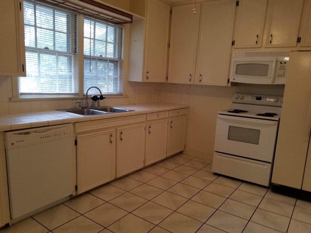
Things you may or may not see from this photo:
*this room is essentially a square
*the only counter space you see is in this photo
*to the left of where this photo was taken, was a doorway and a dining room/eating area on the other side
*to the right, behind where I was standing, was a pantry area
*to the right of the fridge {next to the range} was a doorway leading to a desk area and the back of the house
*not a ton of brightness
*misuse of space to the left of the range – there’s a large gap that isn’t being utilized
Now…here’s the after:
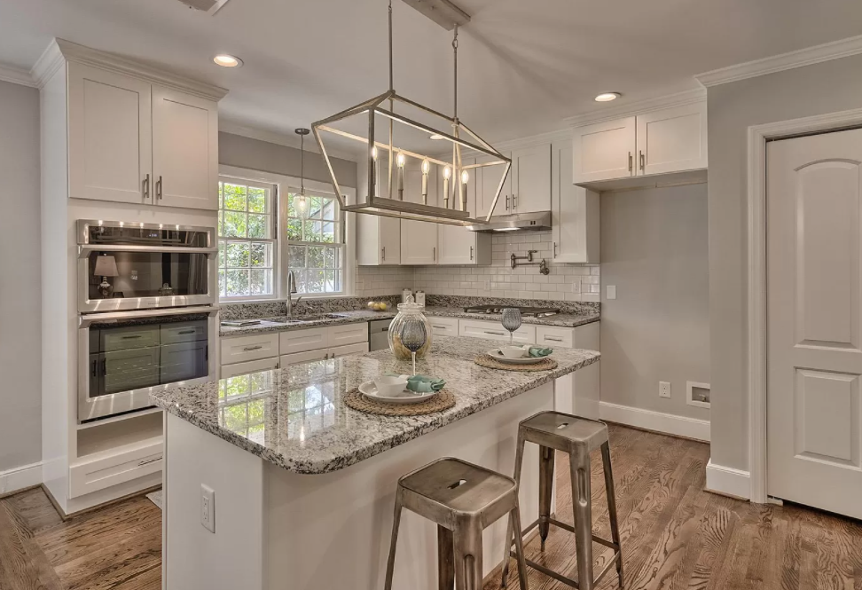
The biggest thing for this space was utilization of the square footage we had. It was really a large space and I wanted to make the most of it, while also opening it up to the rest of the living area.
Kitchen #2 :: Hemphill :: Before
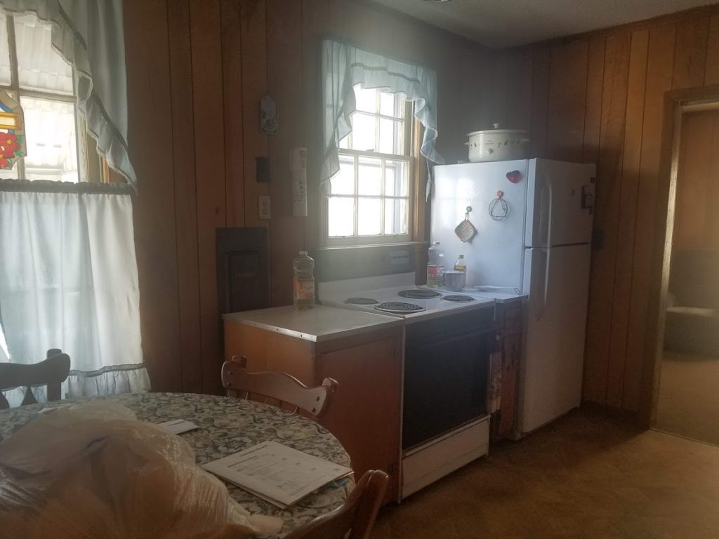
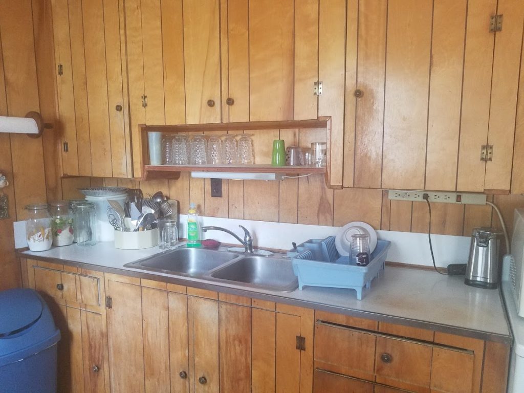
I do love the coziness of this space, however here are some things that you may or may not notice:
*the electrical panel is in the kitchen {not uncommon in some older homes}
*the hot water heater is also in the kitchen
*this was a tight galley kitchen closed off on one end
*there was a small kitchen table + chairs in the space
*natural light was slim
Now…here’s the after:
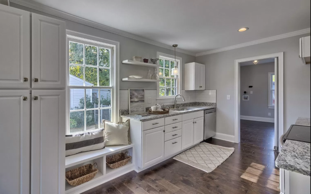
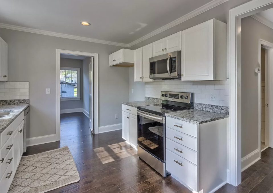
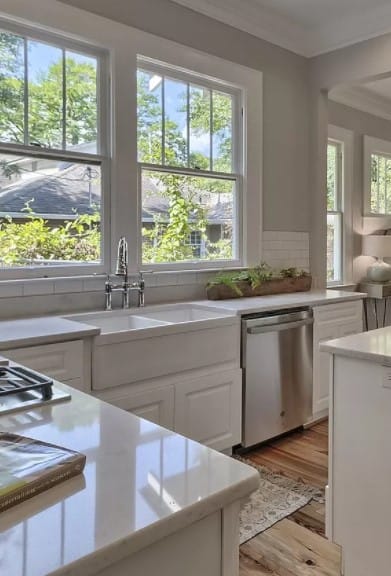
Honestly, this is probably one of my most favorite kitchens so far. One thing I loved about it was having that larger window to contend with, and after trying a few options, we ended up creating a cozy window seat. We completely opened the end of the kitchen that had formerly been closed off to the rest of the home which added so much more light.
Kitchen #3 :: King :: Before
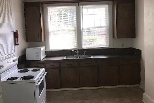
I really just don’t have words for this space. This was a 100+ year old home that had been turned into a duplex and here is the sad state of the downstairs kitchen space. A few things:
*the space was completely underutilized – look at the range just sitting by itself
*there was a doorway on both the left, behind, and right of this photo, making it seem like a galley kitchen, only it was wider than a typical galley
*behind me in this photo there was a very sad ‘pantry’ that I would have been scared to go into at night
*the lighting was very dreary
I’m not sure that you will believe the transformation but,
Now, here’s the after:
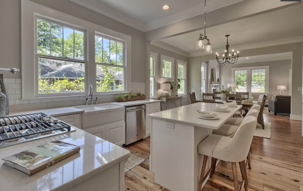
I could spend hours telling you about the demo and the amazing men who spent hours upon hours making this kitchen/home what it is today, but I promised to focus solely on the space. I promise this is the same room ? just with fewer walls to enclose it. Again, it’s all about opening it up to the rest of the home. There was something about this very old home that made me want to give grand life back to her…so we opened the space as wide as we could. We utilized as best we could every inch that she had to give. What you don’t see is to the right of this photo there is a “wall of cabinets” – what my contractor affectionately called it. It’s where the refrigerator and the double oven are as well as all the storage one would need to host a fabulous dinner party for all their friends.
I’m a big fan of the flow in any residence. Kitchens are definitely a favorite room to design because it truly is the hub of the home. When it comes to figuring out the kitchen specifically, I envision myself in the space, with kids and friends hovering around the room. Between a Saturday morning eating pancakes as a family to a grand Friday night dinner party.
I ask questions like, where will people sit or stand? Where will the food go? If I’m cooking supper, can I see the kid that is screaming his head off?
It’s a process that requires great consideration of who might live there, because we never know.
I’d love your feedback on the kitchens in this post. What do you like or don’t like? What would you like to see in future C&C at Home? I’m so grateful for all of your comments!
Until next time…


Do you or can you recommend someone in Columbia area that does renovations? We just purchased a farmhouse on 11 acres and need some help on master bath and kitchen
What transformations! Each one is uniquely designed and well planned as to how the space will function. The light pouring in makes a HUGE difference as do the special touches like the farm house sink, lighting, and the hardware you chose. Do you own a business? I would love for you to redesign my kitchen and bath. How do I connect with you? Best regards, Pam
Hey Mrs. Pam! Thank you for your sweet comments. Andrew and I are flipping houses and doing real estate these days. You can find us on social media as Lucas Properties. 🙂
I can message you my number on FB too.